2018年8月18日雅思大作文机经预测:话题16
来源 :中华考试网 2018-08-16
中2018年8月18日雅思大作文机经预测:话题16
参考题目16
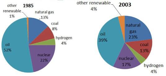
The pie charts show the proportion of the energy produced from different sources in a country between 1985 and 2003.
图片
解题思路
【首段】总述1985年到2003年某国各能源比例 【二段】分述石油和核能比例变化 【三段】分述天然气煤炭和氢气比例变化 【尾段】总述各能源的比例
范文
The pie charts present the change of the percentage of the energy produced from various sources in a particular country from 1985 to 2003. It is clear that oil was the most dominant sources from which the energy was produced throughout the whole period, although it dropped from 52% in 1985 to 39%. Likewise, nuclear also declined, but much less significantly to 17%, becoming the third primary source from which the energy was produced. The percentage of natural gas, on the other hand, witnessed the most noticeable increase during the period, rising from 13% in 1985 to 23% in 2003. Coal and other renewable resources, though whose increase was less marked, rising by 5% and 3% respectively. Interestingly, the proportion of the energy produced from the hydrogen remained stable in 1985 and 2003, making it the least used sources from which the energy was produced. Overall, oil, natural gas and nuclear still constitute a larger proportion of all the sources, while other three sources, namely coal, hydrogen and other renewable, are less used when producing the energy.